Web design system
and components
Year
2023
Client
Gear Patrol
Creative director: Joe Tornatzky
Designer: Anne Reed
About
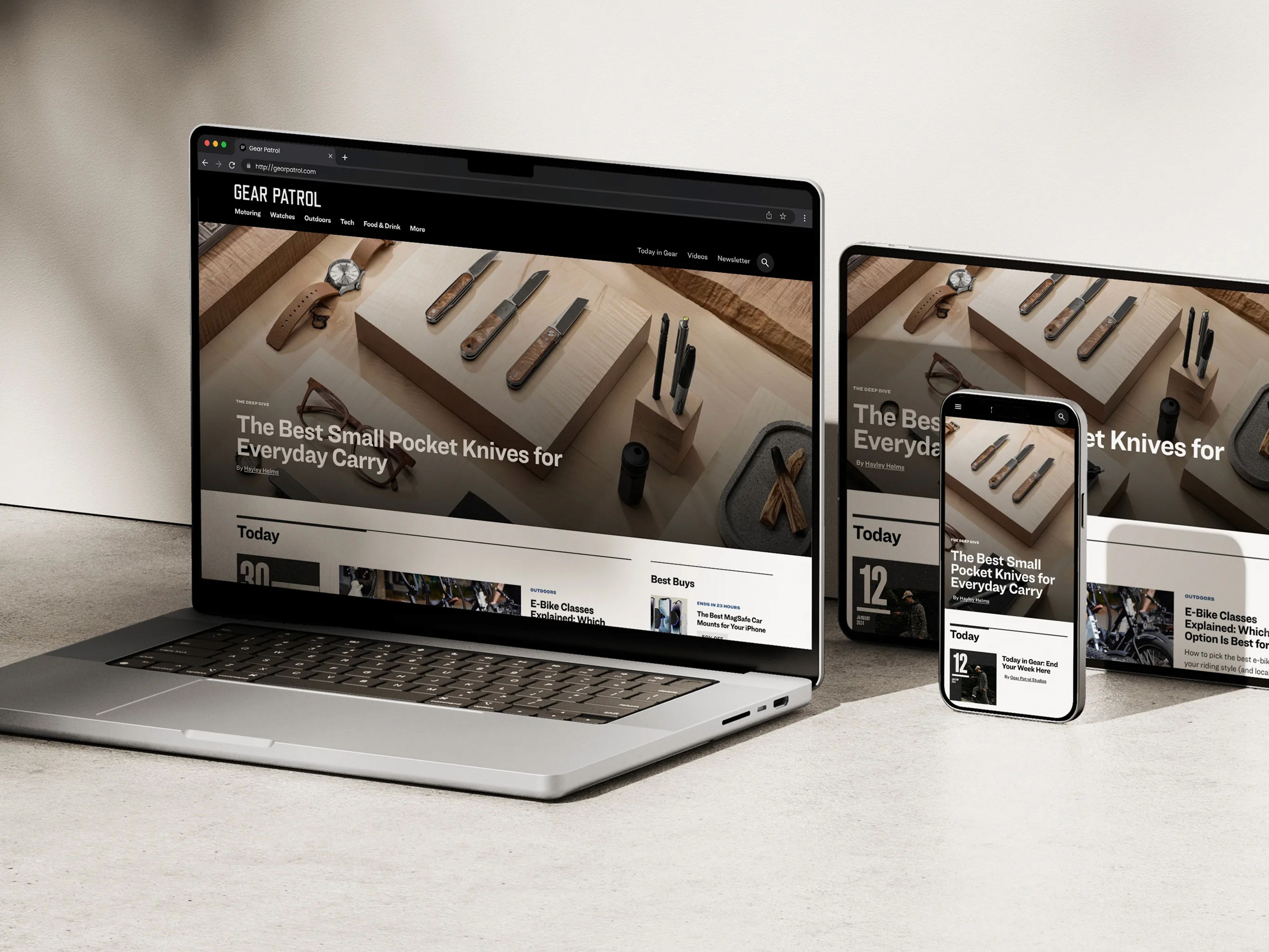
Gear Patrol is a lifestyle publication focused on discovering and reviewing the best in gear, gadgets, and adventure products for enthusiasts and consumers. In 2023, Gear Patrol was in the middle of a website redesign with a new team of developers. They needed support bridging the gap between design and development, so they brought me in to organize their resources and build systems that would translate smoothly for the developers. I also helped implement UI patterns and best practices that served a dual purpose: providing modular storytelling templates for Gear Patrol writers and creating a more user-friendly browsing experience for readers.
Goals
We established core principles that anchored our decisions throughout the design process. Here were our key goals for this project:
Writer’s perspective:
Create template blocks that are easy for writers and journalists to use, minimizing friction in their creative process.
Growth manager’s perspective:
Ensure flexibility and modularity to enable quick iterations for user testing, allowing the team to respond swiftly to trends and topics that interest readers.
Reader’s perspective:
Make it easier for readers to access articles and recommended products that align with their interests.
Typography
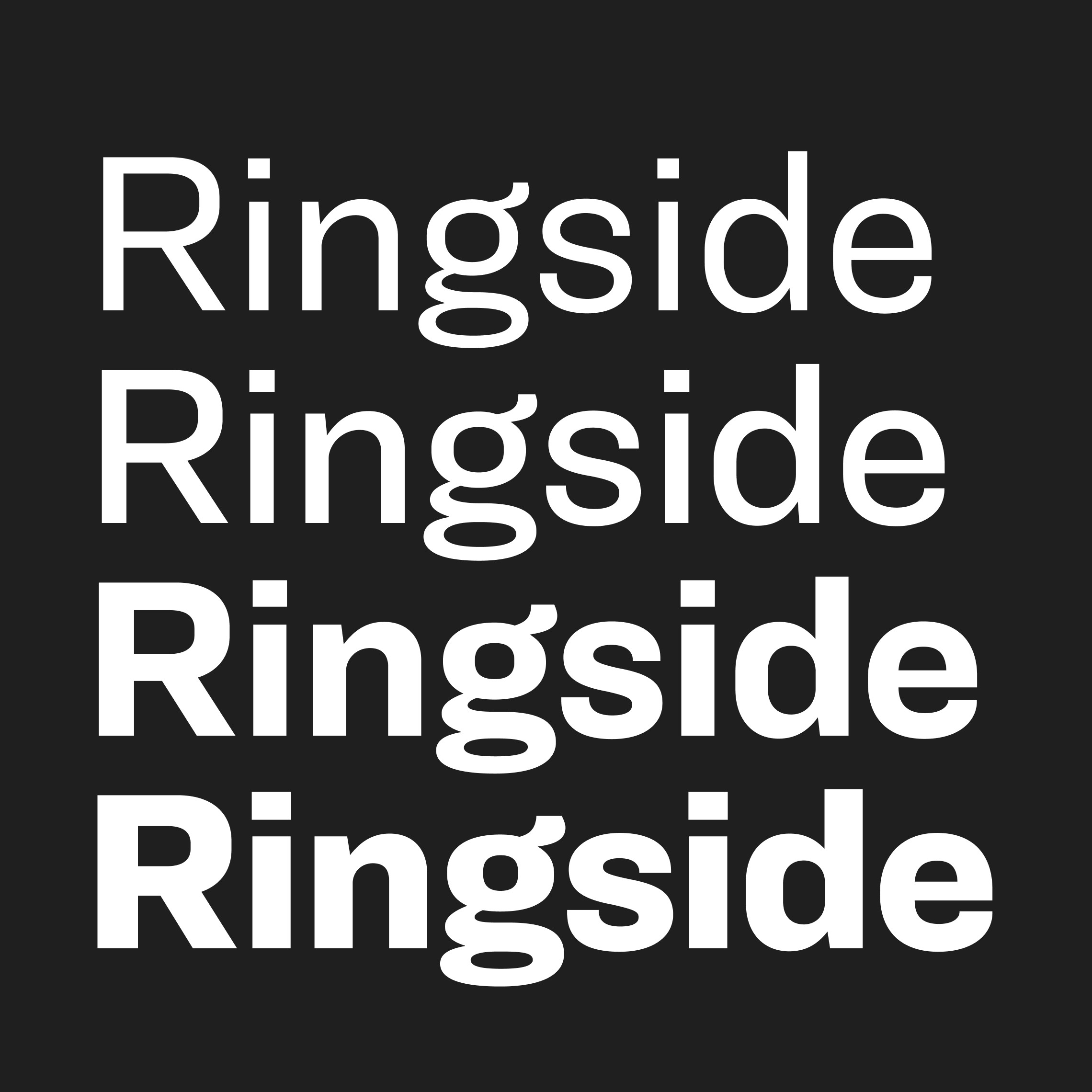
Our first priority was to simplify the design system. Before the redesign, writers could choose from 3–4 different fonts for headers and body copy. We streamlined this by standardizing with Ringside for most of the site, which addressed two key issues: it reduced the number of variables in both the design system and backend, minimizing elements that need management or updates; and it eased cognitive load for writers, allowing them to focus more on crafting their stories.
Type scale
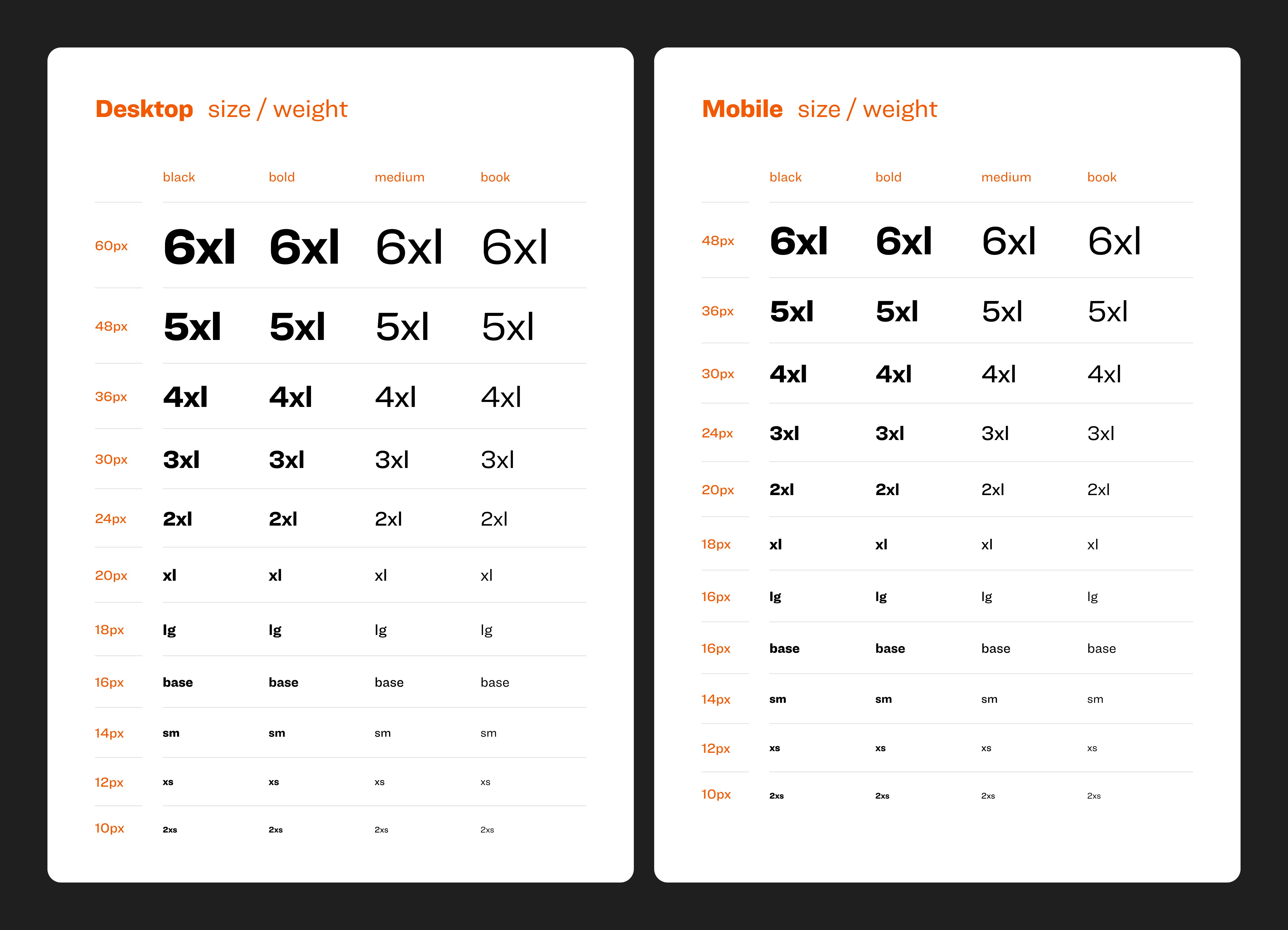
For the type scale, we chose a “t-shirt sizing” model instead of an approach that assigns font sizes and weights to categories like “header” or “body copy.” This method is more flexible and scalable, allowing designers to switch between weights and typefaces easily without causing variable bloat.
Supporting typefaces
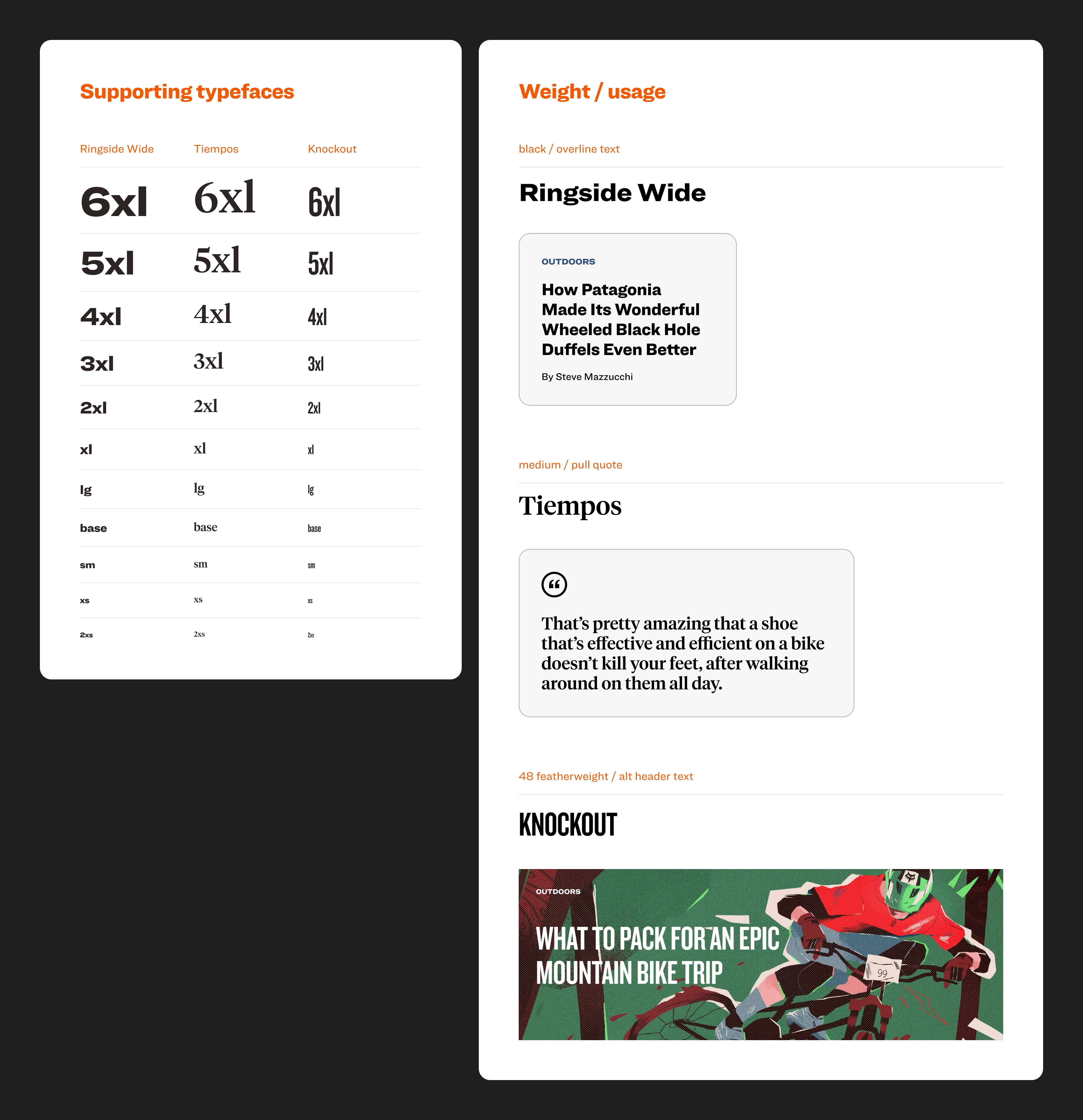
While we wanted to simplify the system, we also wanted to make sure we were preserving Gear Patrol’s brand essence. Since typography is a core part of Gear Patrol’s identity, we kept three supporting typefaces. Although these are unlikely to be used at smaller sizes, we applied the same type scale for consistency and provided clear examples of how each supporting typeface should be used.
Master image upload
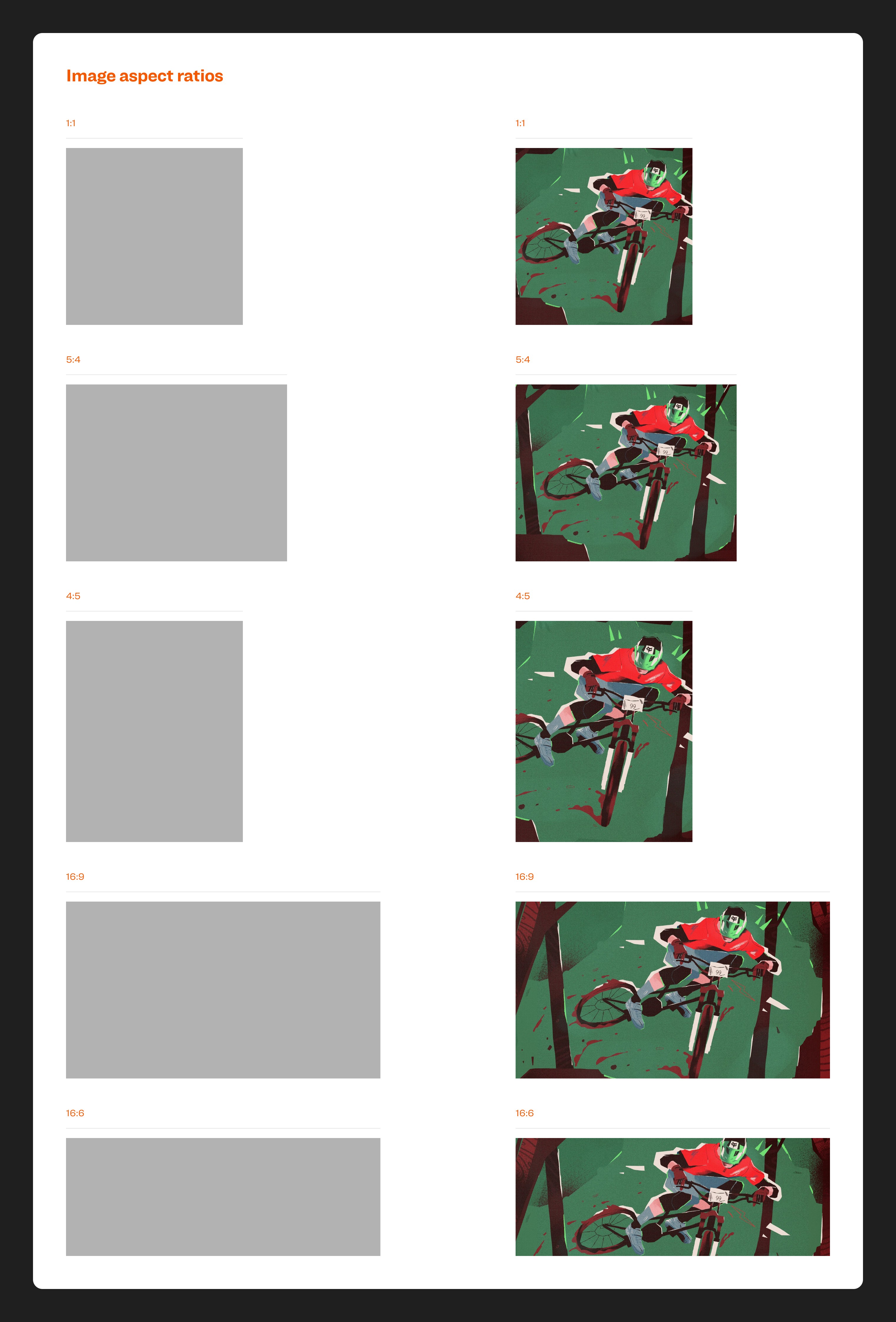
To streamline the workflow of writers at Gear Patrol, we implemented automated image processing features that eliminate manual resizing and cropping. Each content block has pre-defined aspect ratios and automatically sets a focal point for uploaded images. This not only simplifies the writing process but ensures visual consistency across the entire website.
Spacing scale
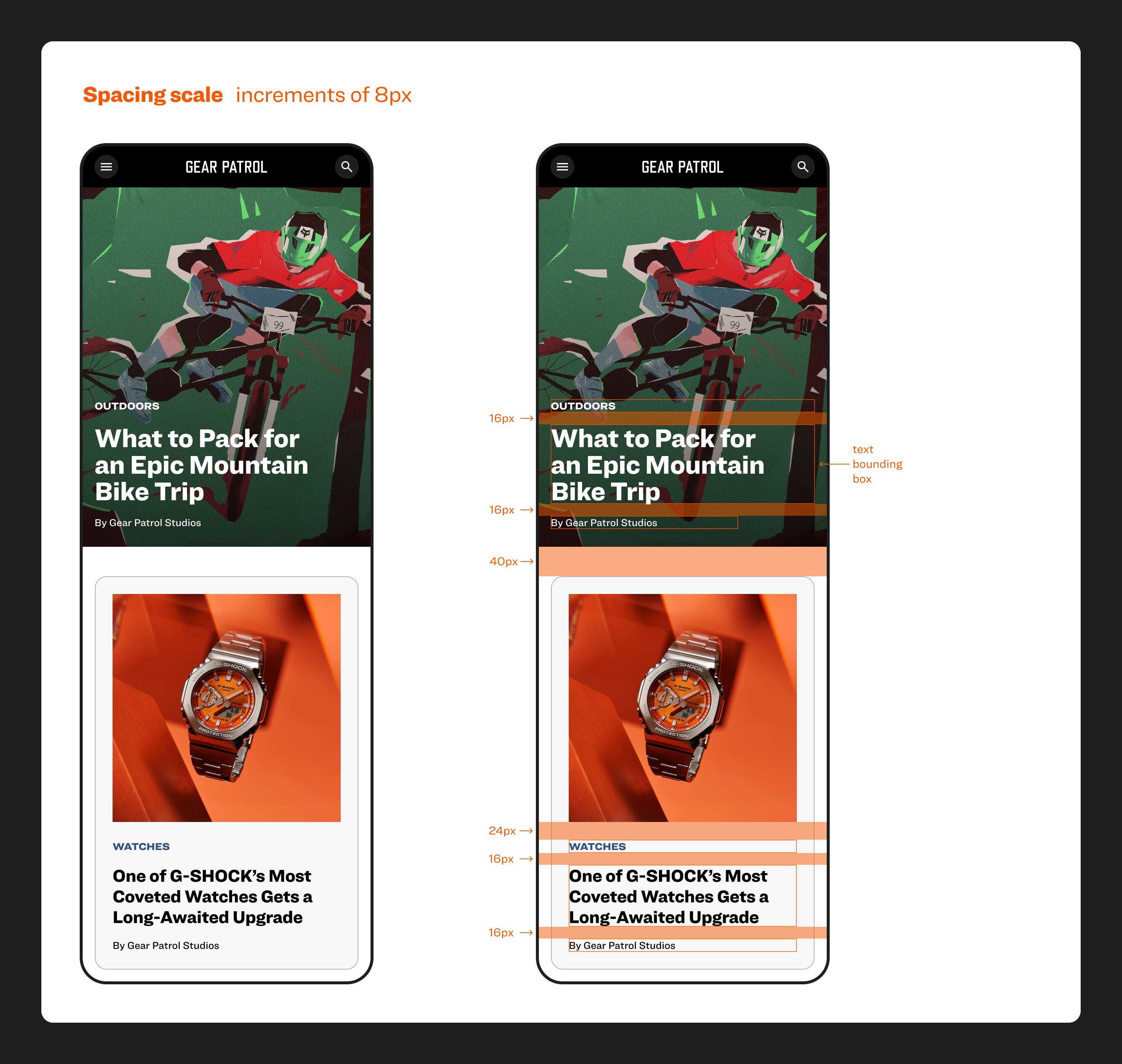
We established an 8px base spacing unit for the new UI design, which creates a sense of order and balance. It also helps streamline the process of creating new design layouts.
Card-based layouts
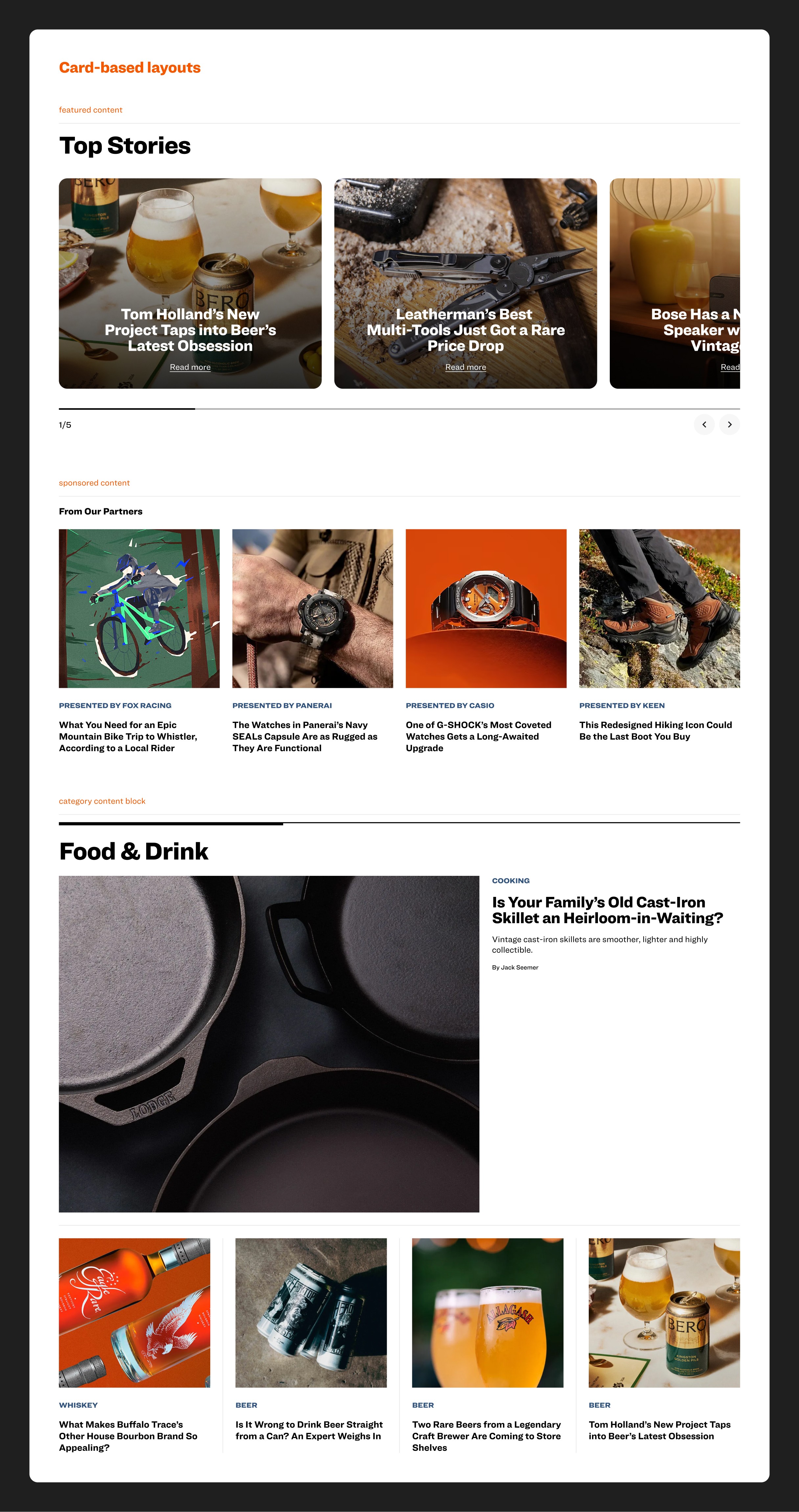
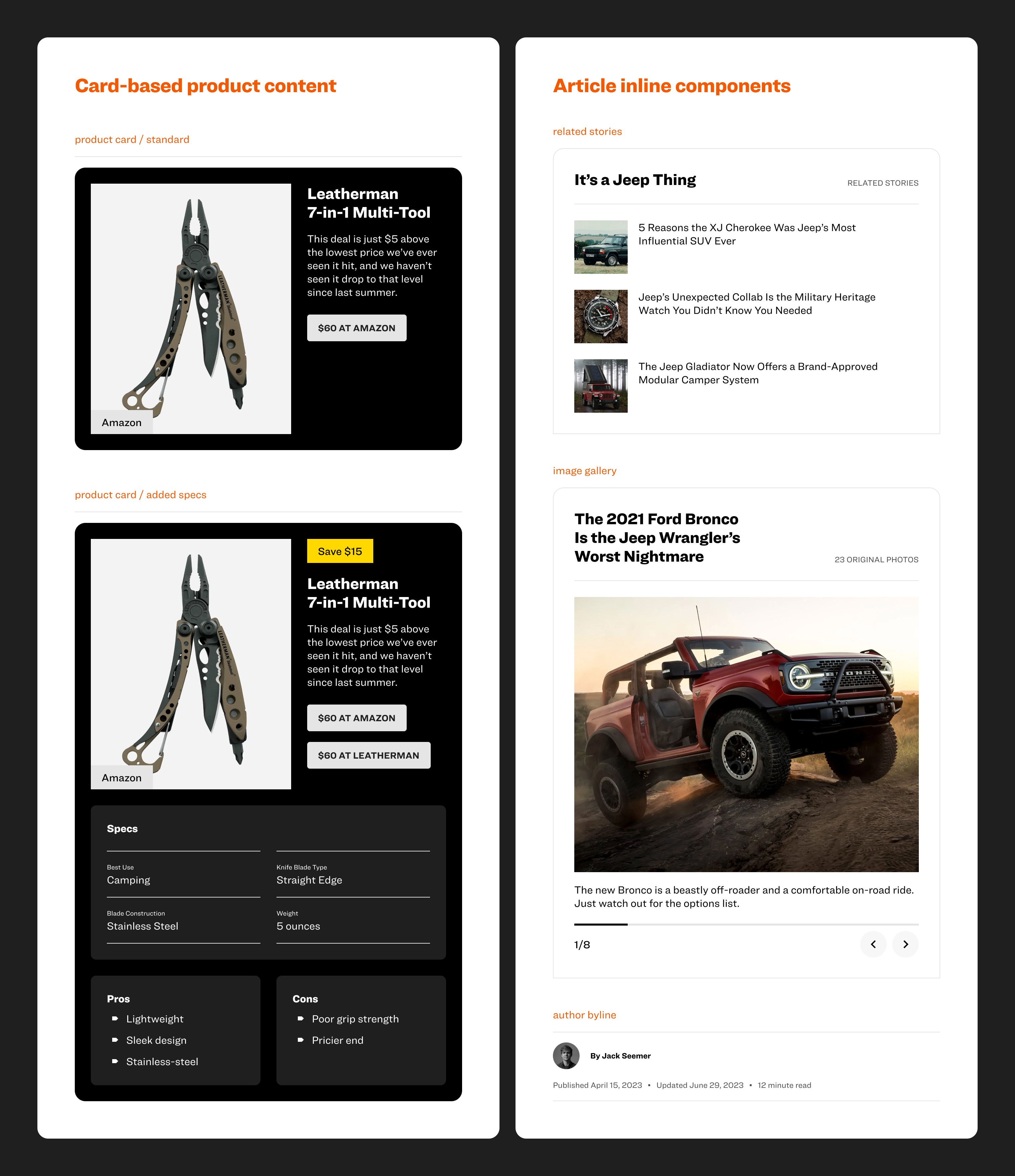
With modularity being one of our key goals, opting for a card-based design layout felt like the obvious choice. The flexibility it offers also lends itself well for a website that produces hundreds of diverse visual and written content weekly.
