Rebrand
Year
2019
Client
Richer Poorer
Design: Anne Reed and Cory Espinosa
Photography creative direction: Jenny Alaimo and Katherine Wang
About
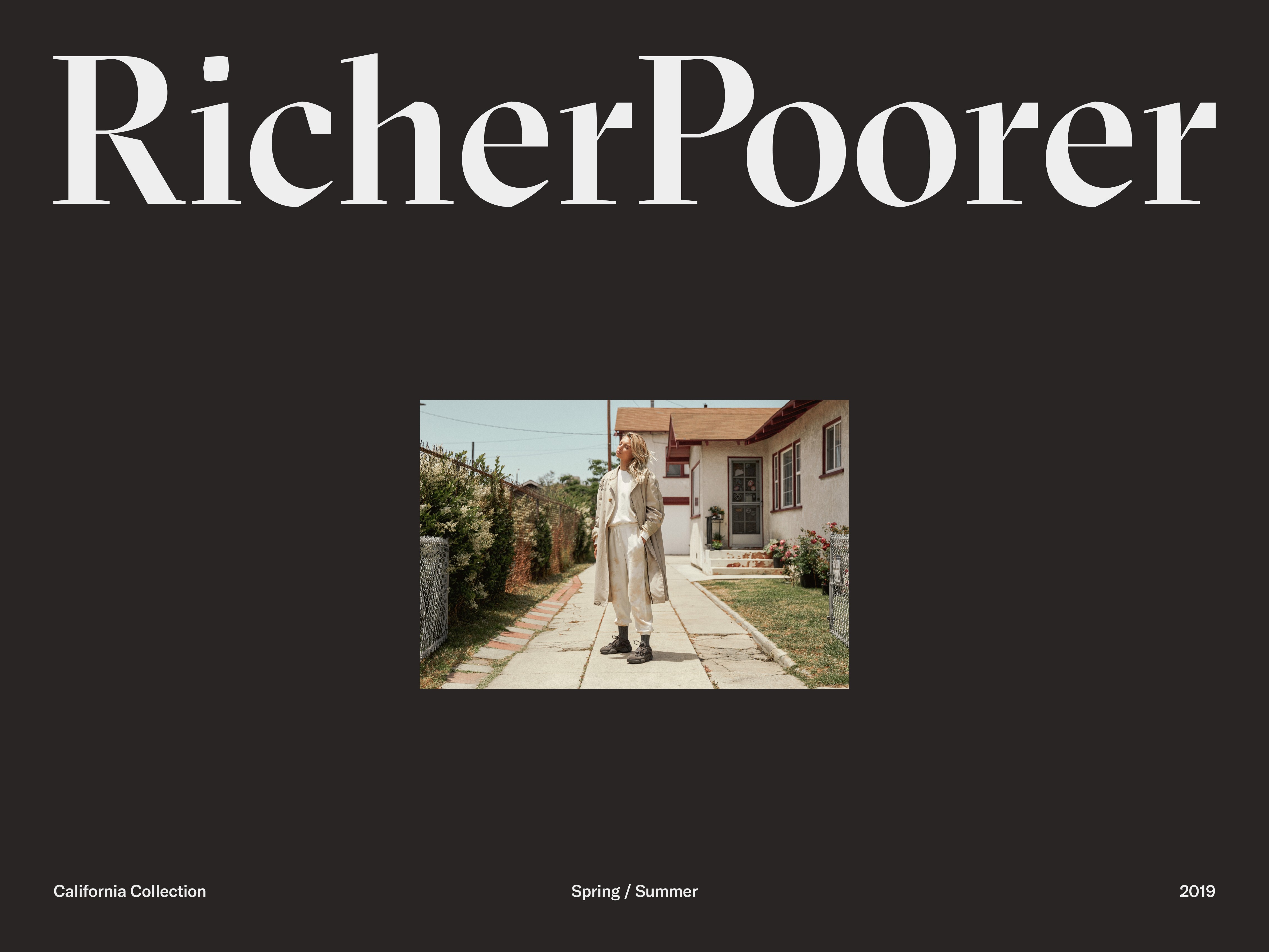
Richer Poorer is a clothing brand with a focus on high quality basics — comfortable enough for inside and stylish enough for outside. In 2010, Richer Poorer launched with socks targeted towards young male consumers. As the brand’s product line expanded and shifted, so did their following. Today their target audience is a more mature, mostly female demographic.
Audience shift
As the brand’s consumer base changed, Richer Poorer shifted their persona from beachy heritage to sophisticated and cool. One major thing remained the same — the brand’s root in SoCal culture. Comfort, inclusivity, and progressiveness are at the core of the brand’s values and ethos. The main challenge was to create something more upscale, but not alienating. Aspirational, yet approachable.
Goal
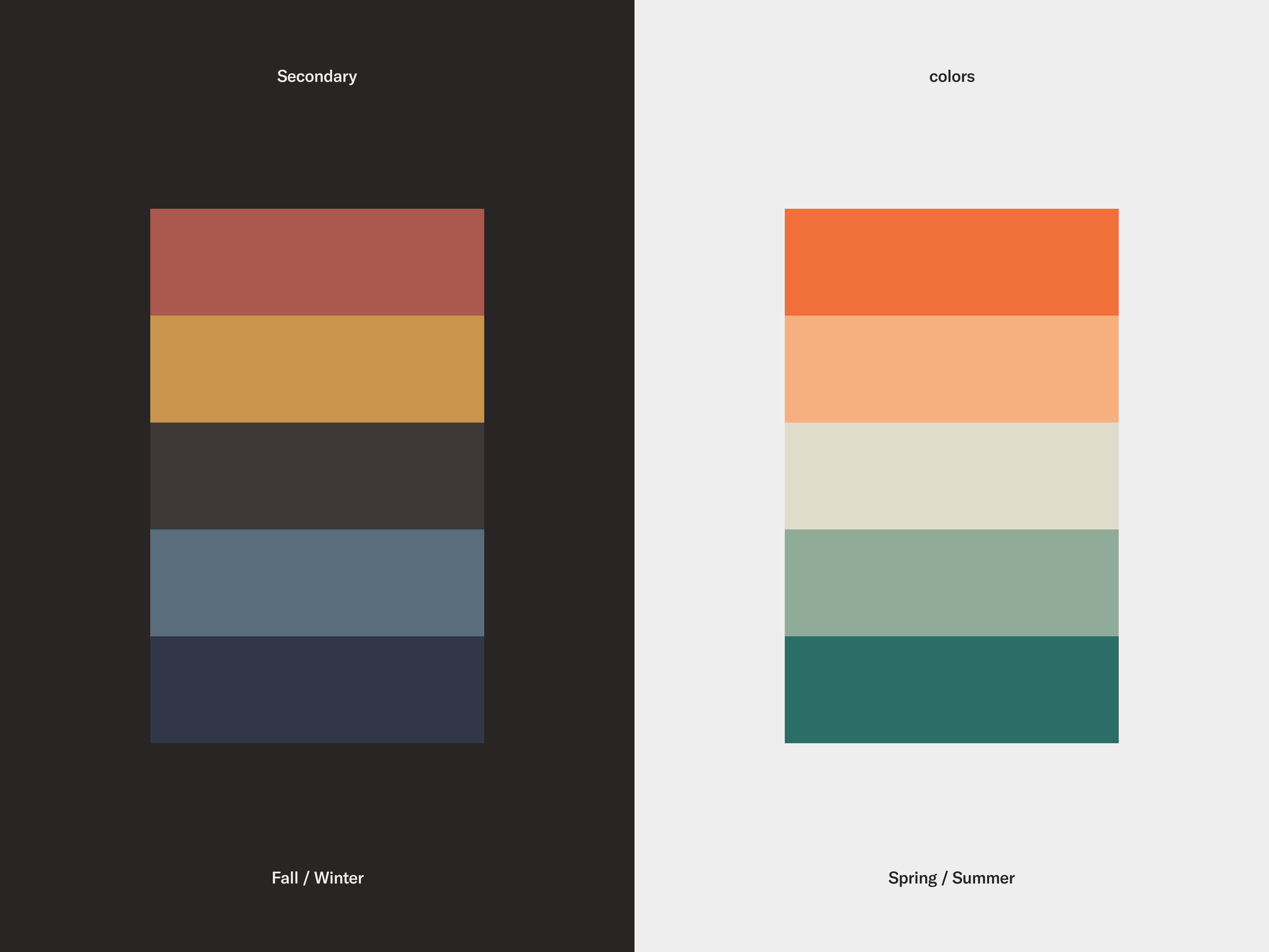
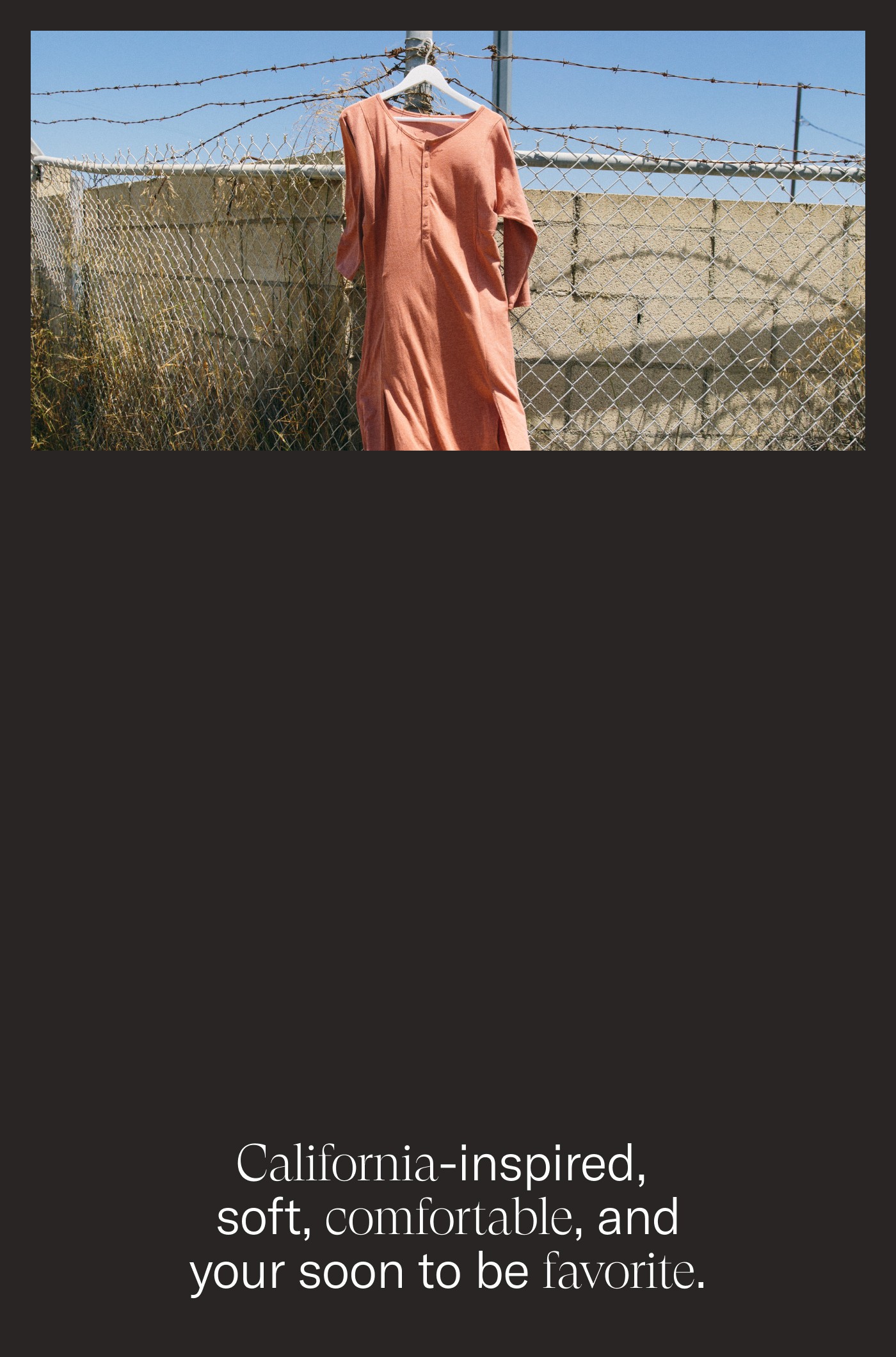
Move away from menswear heritage style. Predominantly use a black and white color scheme as a canvas for rich, grainy, and warm images. Introduce a serif typeface that gave a more feminine feel. Secondary colors are based on the collection of the season. This way assets can feel warm and cozy for Fall and Winter and warm and bright for Spring and Summer.
